Introduction
In the vast digital realm, having a website is just the beginning; making it work for you is the real challenge. Think of it this way: Did you know that on average, only 4% of website visitors actually convert? That means for every 100 people who visit your site, only 4 take the desired action.
Conversion rates, which track this percentage, are key to online success. Whether you’re running an online store, a blog, or a business website, your ultimate goal is to convert visitors into customers, subscribers, or leads. In this guide, we’ll unravel the secrets of increasing your website’s conversion rates through Conversion Rate Optimization (CRO), helping you achieve the success you’ve been striving for.
Section 1: Understanding Conversion Rates
In the digital world, having a website is merely the first step. The true challenge is making it work for you by converting visitors into valuable customers, subscribers, or leads. But what exactly are conversion rates, and why do they matter? In this section, we’ll unravel the mysteries behind conversion rates, exploring their significance and how they impact your online success. Let’s dive into the world of conversions and unlock the secrets to achieving your online goals.
Conversion Rate Demystified
A “conversion” is a specific action you want visitors to take on your website. This could be anything from making a purchase, signing up for a newsletter, filling out a contact form, or clicking a specific button.
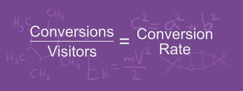
Now, let’s define the conversion rate. It’s a simple percentage that represents the number of visitors who complete the desired action out of your total website traffic. For example, if 100 people visit your site, and 10 of them make a purchase, your conversion rate is 10%.
Types of Conversions
Conversions can take many forms depending on your website’s goals. Here are some common types relevant to web development:
- Sign-ups: Encourage visitors to sign up for a newsletter, create an account, or register for a webinar.
- Lead Generation: Motivate visitors to request a quote, schedule a consultation, or contact you for more information about your web development services.
- Purchases: Convincing visitors to buy a product or service from your online store.
- Downloads: Offer valuable resources like e-books, whitepapers, or case studies to download in exchange for contact information.
- Form Submissions: Getting users to fill out contact forms, request a quote, or participate in surveys.
- Clicks: Guide visitors to click on specific buttons or links that lead them further down the conversion funnel.
We’ll delve deeper into optimizing each conversion type in a later section.
The Conversion Funnel
Understanding the conversion funnel is key to boosting your conversion rates. The conversion funnel represents the journey users take from their first interaction with your site to completing the desired action. We’ll discuss this user journey in detail later, including a visual representation to help you identify areas for improvement. The conversion funnel stages are as follows:
- Awareness: Users become aware of your website through various channels like search engines, social media, or ads.
- Interest: Users explore your site, browsing content, products, or services.
- Desire: Users develop a strong interest in your offerings, often leading them to add items to their cart or sign up for more information.
- Action: Users take the desired action, such as making a purchase or filling out a form.
Key Conversion Rate Metrics
To effectively optimize your conversion rates, it’s important to track and understand key metrics:
- Conversion Rate per Page: The percentage of visitors who complete the desired action on a specific page. This helps identify which pages are performing well and which need improvement.
- Bounce Rate: The percentage of visitors who leave your site after viewing only one page. A high bounce rate can indicate that visitors aren’t finding what they’re looking for or that your page isn’t engaging enough.
- Average Time on Page: The amount of time visitors spend on a specific page. Longer times can indicate higher engagement.
- Exit Rate: The percentage of visitors who leave your site from a specific page. This can help identify problematic pages in the conversion funnel.
By keeping an eye on these metrics, you can make informed decisions to enhance your website’s performance and increase conversions.
Section 2: Crafting a Conversion-Friendly Website
Creating a website that converts visitors into customers goes beyond aesthetics; it’s about designing an experience that guides them towards taking action. In this section, we’ll explore key strategies for optimizing your website’s design and functionality to boost conversions.
User-Friendly Design
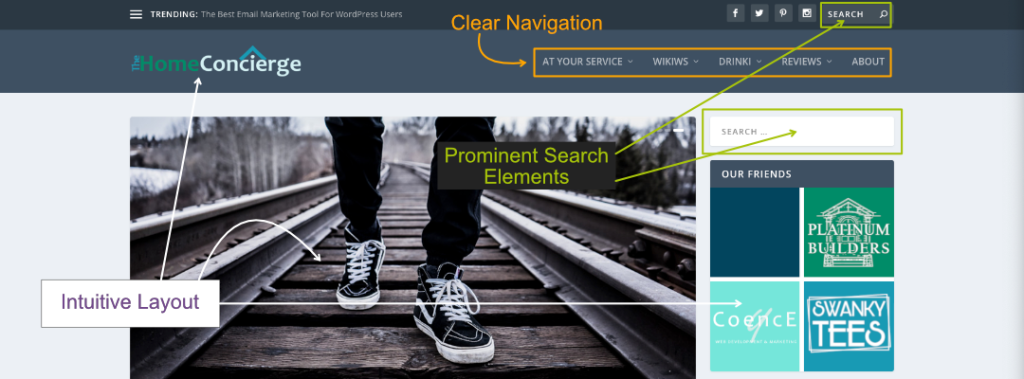
A user-friendly website is not only visually appealing but also easy to navigate. Use clear headings, subheadings, and buttons to guide visitors through your content. But that’s just the beginning. To truly create a conversion-friendly website, focusing on design and user experience (UX) is crucial.
Importance of Clear Navigation
Clear navigation is the backbone of a user-friendly website. Visitors should be able to find what they’re looking for quickly and easily. Here are some tips to ensure clear navigation:
- Simple Menu Structure: Keep your menu straightforward and organized. Limit the number of menu items to avoid overwhelming visitors.
- Breadcrumbs: Implement breadcrumbs to help visitors visually understand their current location within your site and easily navigate back to previous pages.
- Search Functionality: Include a search bar to allow users to find specific content quickly.
Intuitive Layouts
An intuitive layout ensures visitors can navigate your site without confusion. Consider these best practices:
- Consistent Design Elements: Use consistent fonts, colors, and button styles throughout your site to create a cohesive experience.
- Logical Flow: Arrange content in a logical order. Place important information and calls-to-action (CTAs) above the fold for immediate visiblity.
- Whitespace: Use whitespace strategically to avoid clutter and make your content more readable.
Visually Appealing Design
A visually appealing design captures attention and keeps visitors engaged. Here’s how to enhance your site’s visual appeal:
- High-Quality Images: Use high-resolution images and graphics that relate to your content and resonate with your audience.
- Color Scheme: Choose a color scheme that aligns with your brand and is visually pleasing. Avoid using too many colors that can be distracting.
- Typography: Select easy-to-read fonts and use them consistently. Vary font sizes to create a visual hierarchy and guide users through your content.
Mobile-Friendly Experience
In today’s digital age, a significant portion of web traffic comes from mobile devices. Mobile-friendliness is no longer optional; it’s a crucial factor in website design.
Benefits of Mobile-Friendliness
- User Accessibility: Mobile-friendly websites ensure that users can access your site from anywhere, at any time, using their smartphones or tablets.
- SEO Benefits: Search engines like Google prioritize mobile-friendly sites in their rankings, meaning a mobile-optimized site can improve your visibility and drive more traffic.
- Increased Engagement: A seamless mobile experience can keep users engaged longer, reducing bounce rates and increasing the likelihood of conversions.
Responsive Design
Responsive design is the key to achieving mobile-friendliness. It allows your website to adapt to various screen sizes and devices, providing an optimal user experience across the board.
- Fluid Grid Layouts: Use fluid grid layouts that adjust based on the screen size. This ensures that your site’s elements resize and reposition themselves to fit different devices.
- Flexible Images: Ensure that images are flexible and can scale with the layout. This prevents images from being too large or too small on different screens.
- Media Queries: Use CSS media queries to apply different styling rules based on the device’s characteristics.
- Touch-Friendly Elements: Design buttons and links to be touch-friendly, with enough spacing to prevent accidental clicks, improving usability on smaller screens.
Testing for Mobile Optimization
Regularly test your website on various devices to ensure it performs well across all platforms. Consider these steps:
- Emulators and Simulators: Use browser-based emulators and simulators to test how your site looks and functions on different devices.
- Real Device Testing: Whenever possible, test your site on actual mobile devices to get a true sense of the user experience.
- Performance Monitoring: Monitor your site’s performance on mobile devices, focusing on load times and interactivity. Slow-loading sites can deter mobile users.
By prioritizing mobile-friendliness and implementing responsive design, you can create a seamless and engaging experience for users across all devices. This not only enhances user satisfaction but also boosts your site’s conversion potential.
Compelling Content
High-quality content is essential for attracting visitors to your website, keeping them engaged, and ultimately driving conversions. It helps you establish yourself as an authority in your niche, improve your search engine ranking, and build a loyal audience.
Benefits of High Quality Content
Content plays a crucial role in marketing because it:
- Builds Trust and Authority: High-quality, informative content positions your website as an authority in your niche, building trust with your audience.
- Drives Organic Traffic: Search engines prioritize websites with valuable content, helping improve your search rankings and driving organic traffic.
- Engages and Retains Visitors: Engaging content keeps visitors on your site longer, reducing bounce rates and increasing the chances of conversion.
Creating High-Quality Content
Here are some key elements to consider when creating content that resonates with your target audience:
- Relevance: Ensure your content is relevant to your audience’s interests and needs. Conduct audience research to understand their pain points and preferences.
- Value: Provide valuable information that solves problems, answers questions, or offers insights. The more value you provide, the more likely visitors are to return.
- Clarity: Write clearly and concisely. Avoid jargon and complex language that might confuse your audience.
- Engagement: Use a mix of text, images, videos, and interactive elements to make your content engaging. Encourage comments, shares, and other interactions.
Content Formats
Different content formats can engage different segments of your audience. Consider incorporating:
- Blog Posts: Regularly updated blog posts can keep your audience informed and drive traffic through SEO.
- Videos: Videos can convey information quickly and effectively, catering to users who prefer visual content.
- Infographics: Infographics provide a visual representation of data or processes, making complex information easier to understand.
- Case Studies and Testimonials: Showcasing real-life examples and customer testimonials can build credibility and trust.
Content Strategy
A well-defined content strategy ensures consistency and alignment with your goals. Steps to develop an effective content strategy include:
- Content Calendar: Plan your content in advance with a content calendar. This helps maintain consistency and keeps your audience engaged.
- SEO Integration: Integrate SEO best practices into your content creation process to improve visibility and reach.
- Analytics and Feedback: Use analytics to track content performance and gather feedback from your audience to refine your strategy.
By focusing on creating high-quality, engaging content, you can build trust with your audience, establish yourself as an authority, and ultimately drive conversions. Remember, content is a powerful tool in digital marketing, and investing in it will pay off in the long run.
Effective Call-to-Action (CTA)
A call to action (CTA) is a prompt that encourages visitors to take a specific action on your website. It’s a crucial element for driving conversions, guiding users towards completing the desired action. CTAs can take various forms and serve different purposes, but they all share a common goal: to prompt immediate action.
What is a Call to Action?
A CTA is a button, link, or text that instructs visitors what to do next. Effective CTAs are:
- Clear and concise: Use straightforward language that states the desired action (e.g., “Buy Now,” “Sign Up”).
- Action-oriented: Create urgency with phrases like “Limited Time Offer” or highlight benefits like “Get Your Free Trial.”
Strategic Placement of CTAs
Where you place your CTAs matters! Here’s how to maximize their impact:
- Above the Fold: Place primary CTAs where they are immediately visible without scrolling.
- End of Content: Capture engaged readers with CTAs at the end of blog posts or articles.
- Throughout the Funnel: Guide users through their journey with CTAs at different conversion stages (awareness, decision).
- Pop-Ups and Slide-Ins: Draw attention to special offers with pop-ups or slide-ins, but prioritize a smooth user experience.
Designing Effective CTAs
The design of your CTA should stand out while complementing your website’s overall look. Consider these tips:
- Use Contrasting Colors: Choose colors that make your CTAs pop against the background.
- Ensure Readability: Select clear fonts and appropriate font sizes.
- Incorporate Visual Cues: Use arrows, icons, or other visual elements to draw attention.
By strategically placing CTAs, using clear and action-oriented language, and designing them effectively, you can significantly increase the chances of visitors taking the desired actions on your website. Remember, Clear and compelling CTAs are a cornerstone of a conversion-friendly websites.
Experiment with A/B Testing
A/B testing, also known as split testing, is a powerful method for optimizing your website. It allows you to compare different versions of web pages or elements (CTAs, images, headlines) and see which ones perform better with your visitors.
What is A/B Testing?
A/B testing involves creating two different versions of a page element (like a CTA, image, or headline) and showing them to different visitor groups simultaneously. You then measure which variation gets better results in terms of conversions or other key metrics.
Benefits of A/B Testing
- Data-Driven Decisions: A/B testing provides data on what works and what doesn’t, allowing you to make informed website improvements.
- Increased Conversions: Identify the most effective elements to optimize your site for conversions (sales, sign-ups, etc.).
- Improved User Experience: Understand what resonates best with your audience, leading to a more enjoyable experience.
- Reduced Bounce Rates: By refining your content and design, you can keep visitors engaged and on your site longer.
How to Conduct A/B Testing
- Identify Elements to Test: Choose specific elements that you suspect could impact your conversion rates, such as CTAs, headlines, images, or forms.
- Create Variations: Develop two versions of the element you want to test, changing only one variable at a time.
- Split Your Audience: Use an A/B testing tool to randomly split your audience into two groups, showing each group a different variation.
- Collect Data: Run the test for a sufficient period to gather meaningful data. Track key metrics like click-through rates, conversion rates, and bounce rates.
- Analyze Results: Compare the performance of the two versions. Determine which variation performed better and why.
- Implement Changes: Based on the results, apply the winning variation to your live site.
- Continuous Testing: Keep testing other elements to continually optimize your website.
Simplifying A/B Testing with Website Builders
Many website builders, like Divi from Elegant Themes, offer built-in modules to make A/B testing easier. These built-in tools allow you to:
- Easily Create Variations: Quickly set up different versions of elements on your site without needing extensive coding knowledge.
- Automate Audience Splitting: Divide your visitors into test groups, ensuring a fair and randomized distribution.
- Track Performance Metrics: Monitor and compare the performance of each variation in real time.
- Implement Winning Variations: Seamlessly apply the best-performing version to your live site with minimal effort.
By utilizing these A/B testing tools, even beginners can streamline the process and make data-driven improvements to their website, ultimately leading to higher conversion rates and a better user experience.
Section 3: Building Trust and Credibility
Trust is essential for converting website visitors into loyal customers. When visitors trust your brand, they’re more likely to engage with your site and take action. Here are key strategies to build trust and credibility:
- Clear Communication: Ensure your website communicates clearly with visitors. Use simple language to explain your products or services, pricing, and policies. Avoid hidden fees or unclear terms that might raise suspicion.
- Leverage Social Proof: Display authentic customer testimonials and reviews prominently on your site. Positive experiences shared by others act as social proof, reassuring potential customers about the quality and reliability of your offerings.
- Showcase Your Expertise: Create valuable and informative content like blog posts, guides, case studies, and whitepapers. This content showcases your knowledge and authority, building credibility with visitors.
- Trust Seals and Certifications: Include trust badges, security icons, and industry certifications on your website. These symbols reassure visitors about the security of their data and transactions, fostering trust in your brand.
- Transparency with Privacy Policies: Clearly outline your privacy policy to demonstrate your commitment to protecting visitors’ data and privacy. Transparency regarding how you collect, use, and protect personal information enhances trust and credibility.
- Prioritize Security: Invest in robust website security measures to protect against data breaches and cyber threats. Secure payment gateways, SSL certificates, and regular security audits signal to visitors that their information is safe with you.
By implementing these strategies, you can build trust and credibility with your website visitors, ultimately driving conversions and business success.
Section 4: Streamlining the Conversion Process
Making it easy for visitors to take action on your website is key to boosting conversions. Here are key strategies to streamline the conversion process and remove any friction that might prevent users from completing desired actions:
- Clear Call-to-Action (CTA) Design: Design CTAs (calls to action) that are easy to understand and visually appealing. Use eye-catching colors, buttons, and persuasive copy to guide visitors towards the desired action. Make CTAs prominent and easily accessible throughout your website.
- Simplify Forms: Don’t overwhelm users with lengthy forms. Only ask for essential information and consider implementing autofill options to expedite form completion.
- Offer Guest Checkout: For e-commerce websites, provide a guest checkout option to reduce cart abandonment. Many users prefer a quick purchase without creating an account. This streamlines the buying journey and improves conversion rates.
- Progress Indicators: In multi-step processes (checkout, forms), provide progress indicators to keep visitors informed. Progress bars or step-by-step guides help users understand where they are in the process and how much is left, reducing frustration and increasing completion rates.
- Mobile-Friendly Conversion: Ensure a seamless conversion process on mobile devices. With more users accessing websites on smartphones and tablets, mobile optimization is crucial. Make sure CTAs, forms, and checkout are responsive and easy to navigate on smaller screens.
- Testing and Refine: Regularly test and iterate on your conversion process. A/B testing different variations of CTAs, forms, and checkout flows can reveal what resonates best with your audience and drives the highest conversions.
By focusing on making it easy for users to take action on your website. This smooth and intuitive conversion process improves user experience and increases the likelihood of visitors completing desired actions, leading to business success.
Section 5: Analyzing and Optimizing
Understanding how visitors interact with your website is crucial for making improvements and boosting conversions. By analyzing website data, you can identify areas for optimization and ensure your site is performing at its best. Here are key techniques to employ:
- Google Analytics: Harness the power of Google Analytics to gain valuable insights into your website’s performance and user behavior. Track key metrics such as bounce rate, session duration, and page views. Use the Behavior Flow report to visualize how users navigate through your site and identify where visitors drop off. This helps you understand how users interact with your site and optimize for better conversions.
- Monitor Conversion Funnels: Create and monitor conversion funnels within GA4 to track user behavior throughout the desired action (purchase, sign-up). Identify bottlenecks or points where users are dropping off and optimize each step to streamline the conversion journey. By monitoring conversion funnels. This data-driven approach helps you pinpoint areas for improvement and ultimately increase conversions.
- Heatmap Insights: Use heatmap tools (Hotjar, Crazy Egg) to gain a visual understanding of user interaction. Heatmaps show where users click, scroll, and spend their time on your site. Analyze these patterns and trends to adjust your design and content for optimal user engagement. Heatmaps provide valuable insights to optimize your website for maximum effectiveness.
Regularly analyzing and optimizing your website based on insights from tools like Google Analytics, monitoring conversion funnels, and utilizing heatmap insights, you can continuously improve the user experience and increase conversion rates. These data-driven techniques inform your decision-making process and ensure your website delivers optimal results.
Section 6: Personalization and Targeting
Tailoring your website experience to different visitor groups is a powerful strategy for boosting conversion rates. Here are key strategies for personalization and targeted content:
- Website Personalization: Deliver tailored content and offers to individual users based on their preferences and behaviors. This creates a more engaging experience, increasing the likelihood of conversion.
- Customer Segmentation: Divide your audience into groups based on demographics, interests, or purchase history (e.g., age, location, past purchases). Tools like Google Analytics or Mailchimp allow you to create segments and deliver personalized content to each group.
For example, an e-commerce website could segment customers based on past purchase behavior and preferences. Customers who frequently buy sports apparel may receive personalized recommendations for new arrivals in that category, while those interested in electronics may receive targeted promotions for upcoming product launches.
- Exit-Intent Popups: These popups appear when a visitor shows intent to leave your website (moving cursor towards the browser bar). These popups typically offer a last-minute incentive or personalized offer to encourage visitors to stay or complete a conversion before exiting.
Exit-intent popups can be effective, but use them carefully to avoid annoying users and negatively impacting their experience. Timing and relevance are crucial to their success.
- Remarketing:
Reconnect with visitors who have previously interacted with your website but did not convert. This is done through retargeting ads displayed on other websites and social media platforms. Remarketing allows you to stay top-of-mind with potential customers and encourage them to return and complete their purchase.
Benefits of remarketing include increased brand awareness, higher conversion rates, and improved return on investment (ROI) for your advertising spend. By showing relevant ads to users who have already expressed interest in your products or services, you can effectively nurture leads and drive them towards conversion.
By implementing personalization and targeting strategies, you can create a more tailored and engaging experience for your website visitors, ultimately increasing conversion rates and driving business growth.
Section 7: Testing and Continuous Improvement
Increasing conversion rates is a marathon, not a sprint. It’s an ongoing process of refining and optimizing your website for better performance. Here’s how to ensure your website keeps converting at its best:
- Continuously Test Testing (A/B Testing): Embrace the power of split testing, also known as A/B testing, to continuously experiment with different elements on your website. Test variations of headlines, images, CTAs, and layout to determine which versions resonate best with your audience and drive higher conversions. By constantly testing and making adjustments, you’ll gain valuable insights to optimize your website for maximum effectiveness.
- Keep Your Content Fresh: Fresh and up-to-date content keeps visitors engaged and coming back for more. Regularly update your content with new blog posts, product information, and relevant content that provides value to your audience. Outdated content can deter visitors and undermine your credibility, so make it a priority to keep your website content fresh and relevant.
- Track Key Metrics: Stay informed about your website’s performance by monitoring key metrics like bounce rate, time on site, and conversion rate. These metrics provide valuable insights into how users are interacting with your site and can help you identify areas for improvement. Use this data to guide your optimization efforts and make informed decisions about where to focus your attention.
Embrace Ongoing Optimization
Continuous improvement is essential for Conversion Rate Optimization (CRO). By consistently testing, analyzing results, and making data-driven changes, you can ensure your website evolves to meet the needs and preferences of your audience. Embrace the ongoing journey of optimization, and you’ll be well on your way to unlocking the full potential of your website and driving higher conversion rates.
Continuous improvement is essential for Conversion Rate Optimization (CRO). By consistently testing, analyzing results, and making data-driven changes, you can ensure your website evolves to meet the needs and preferences of your audience. Embrace the ongoing journey of optimization, and you’ll be well on your way to unlocking the full potential of your website and driving higher conversion rates.
The Road to Conversion Success is Paved with Continuous Improvement
Increasing your website’s conversion rates is an ongoing journey in the dynamic world of web development. This guide explored essential strategies to unlock your website’s potential and drive higher conversions.
Every step, from user-friendly design to data-driven optimization, plays a crucial role. Embrace A/B testing, keep your content fresh, and track key metrics to continuously refine your approach and convert visitors into loyal customers.
Remember, in the ever-evolving digital landscape, small changes can yield big results. Conversion rate optimization (CRO) is not a one-time fix, but an ongoing process of testing, analyzing, and refining. It’s the key to unlocking success in web development.
So, take action! Experiment with different strategies, leverage data insights, and watch your online success soar. The journey to higher conversion rates is continuous, but by delving deeper into CRO, you can stay ahead of the curve and achieve meaningful results for your website.

